Client Overview
Sustainable Innovation Network (SIN) is a student-run organization at Northeastern University that fosters social entrepreneurship and innovation. Their goal is to provide low-barrier access to resources for students looking to launch for-impact, for-profit ventures.
The Problem
SIN lacked a strong visual identity and an online presence, making it difficult for students to understand their mission and get involved. Our goal was to create a distinct, inclusive brand identity that reflected SIN’s values, design and develop a user-friendly website to serve as a hub for student engagement, and build a flexible design system to ensure consistency across future marketing materials.
Users & Audience
The primary audience was students at Northeastern University, particularly those outside of traditional business fields who were interested in social entrepreneurship. Key user needs included a welcoming and accessible brand identity that didn’t feel overly corporate. The website needed to provide clear pathways for joining, collaborating, and accessing resources. Additionally, the branding assets had to be scalable for both digital and print use.
My Role & Contributions
I served as the Design Lead, responsible for facilitating client meetings and brand workshops to refine the vision. I led the design team through branding, UI/UX, and iteration processes. Additionally, I finalized the brand book, including logos, typography, color systems, and sticker assets. My role also included collaborating with the development team to ensure a seamless design-to-code translation while managing timelines and team coordination, balancing student schedules with project deadlines. I was the primary creative and strategic lead, ensuring the execution met both client and user needs.
Design Process
Branding
To establish branding and visual identity, I led a collaborative branding process, ensuring alignment between client needs and design execution. The design process was influenced by specific constraints and challenges that shaped our approach and solutions.
A significant constraint was the strict semester timeline, as the project had to be completed within one semester. Team members balanced co-ops, coursework, and extracurriculars, adding complexity to scheduling. By the end of the semester, most designers were unavailable, leaving only me and the Dev Lead to finalize and hand off the project.
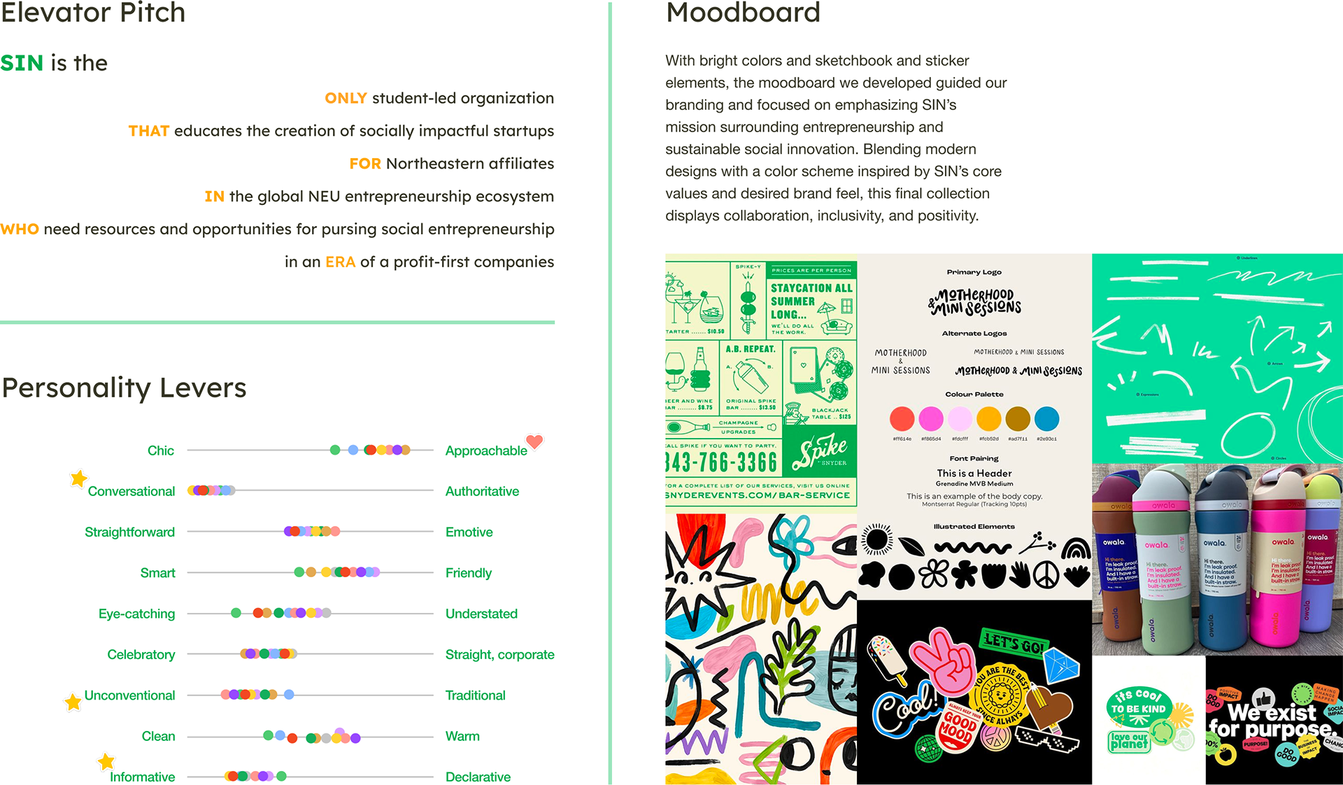
Additionally, the client's unclear brand direction required innovative brand exercises to help define their identity. To address this, I led brand exercises including Personality Levers, Elevator Pitch Workshop, the Is, Is Not, Could Be Framework, and the If Our Brand Were a Person Activity.
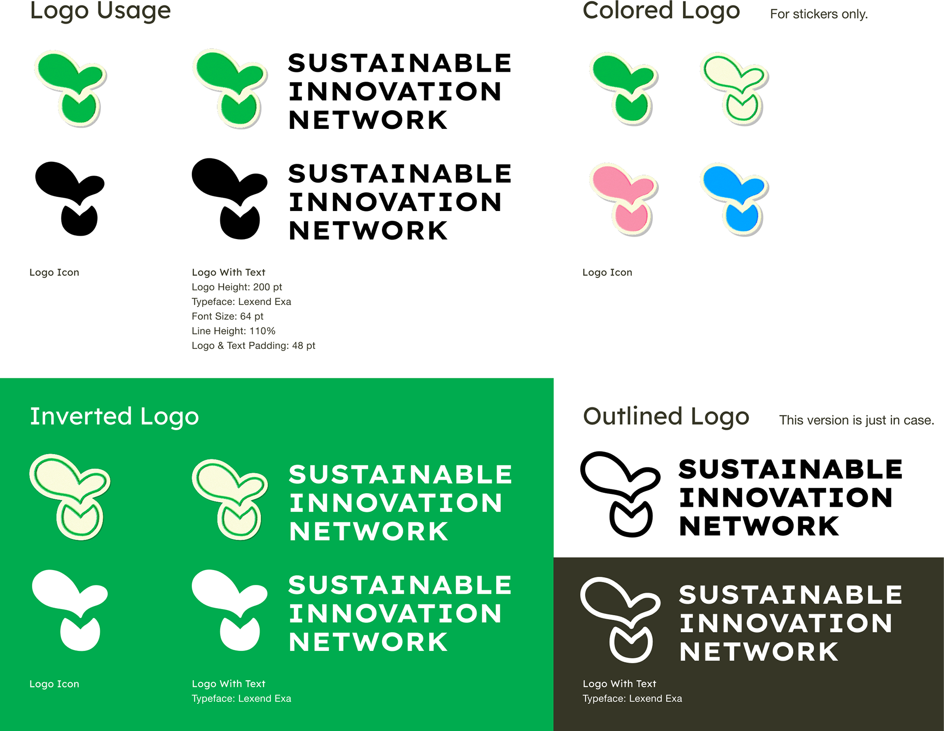
For the logo design, we explored multiple sketches and iterations with the design team. Client feedback sessions helped refine the direction, leading to the final bold yet accessible logo that captured the organization’s essence.
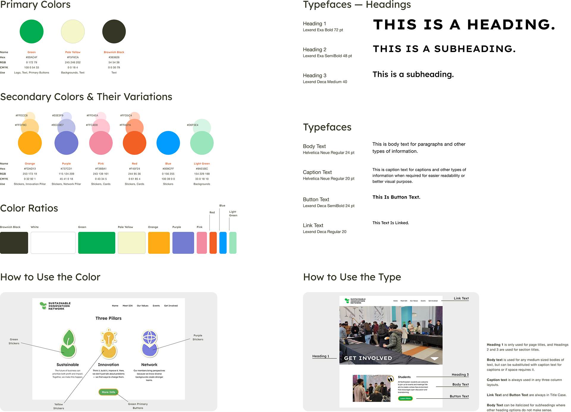
For typography and color system, we selected *Lexend Exa* and *Lexend Deca* from Google Fonts, prioritizing accessibility and digital legibility. The color palette was built to be multi-layered and colorful, reflecting SIN’s diverse impact areas.
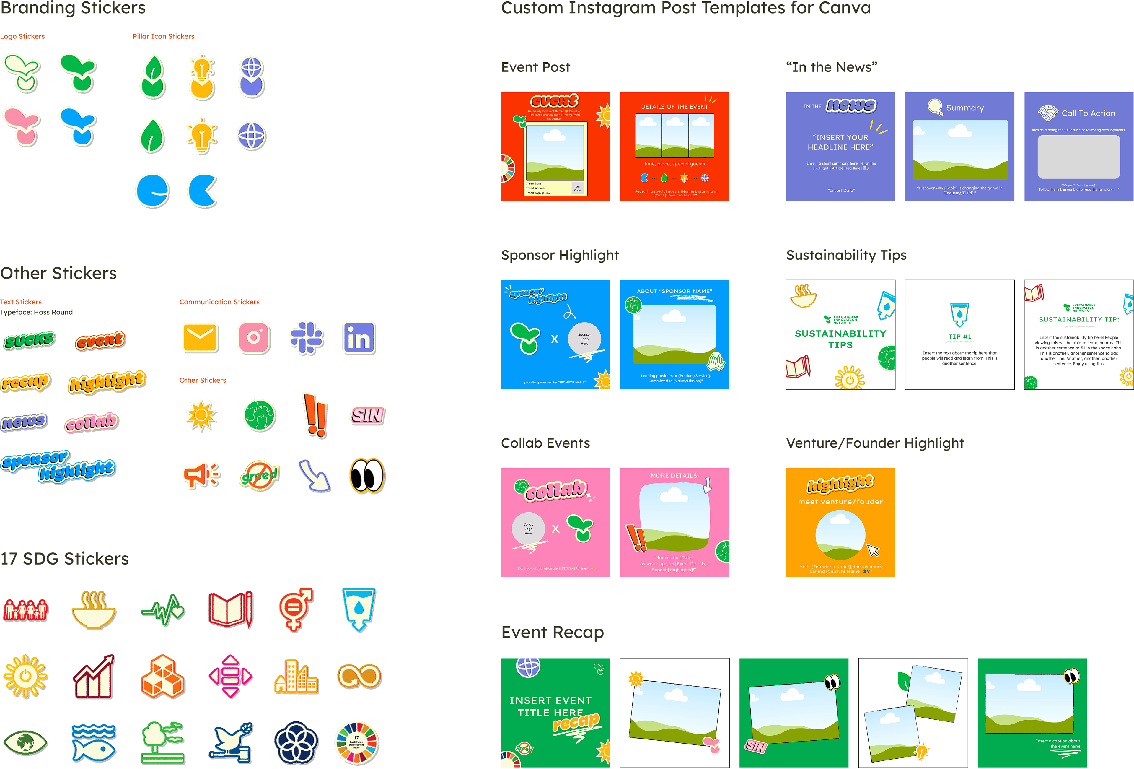
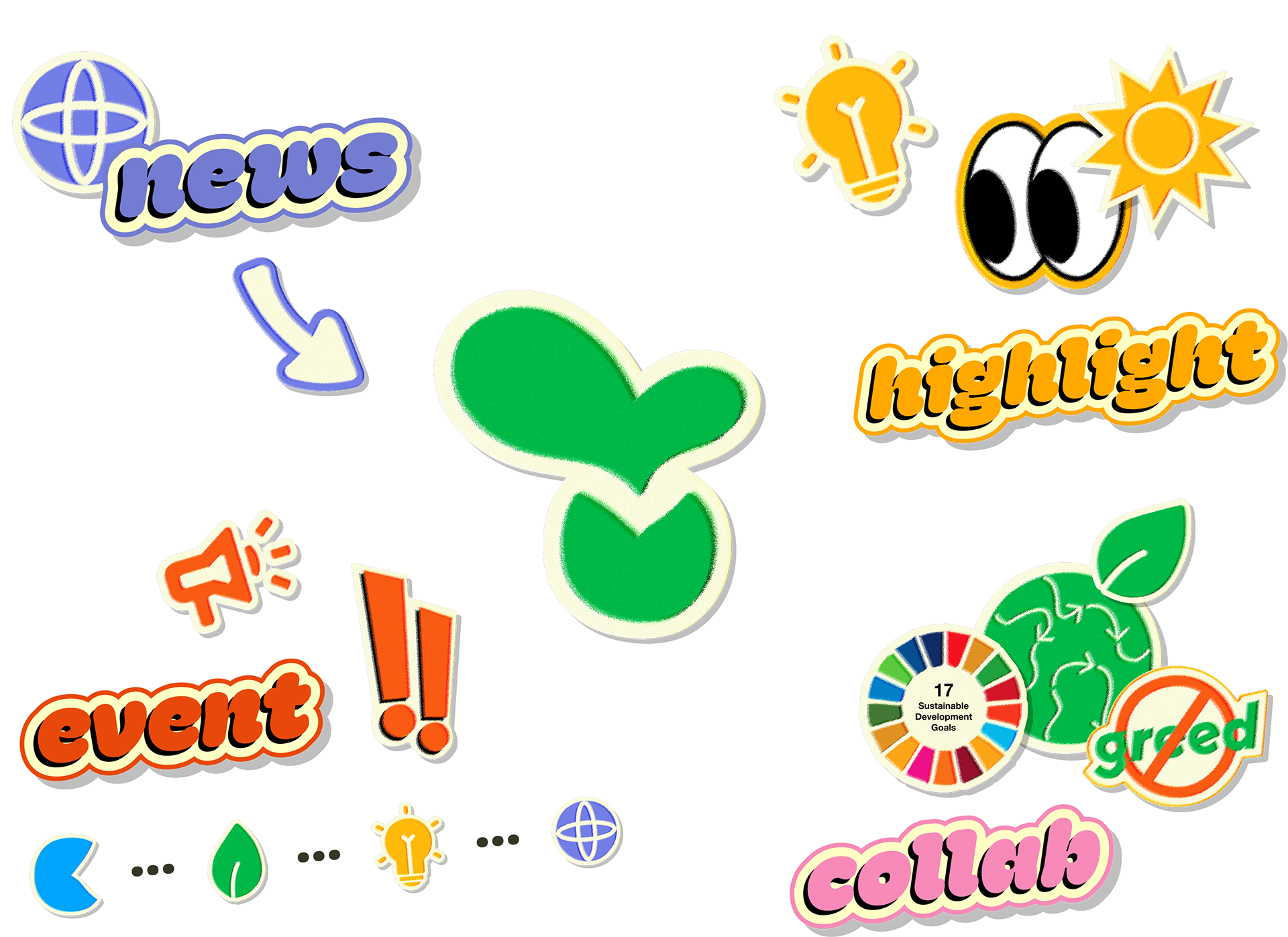
The brand book documented logo usage, color guidelines, and typography rules for future branding needs. We also developed a sticker system to visually represent the 17 UN Sustainable Development Goals (SDGs), reinforcing the brand's identity.
UI/UX
Balancing design and development was also a challenge. Unlike typical projects, developers created lo-fi wireframes under my supervision, allowing designers to focus on branding and UI work. I coached developers on Figma, ensuring smooth collaboration between design and dev teams. I handled the final prototype and design-to-dev handoff, utilizing Figma Dev Mode for efficient implementation.
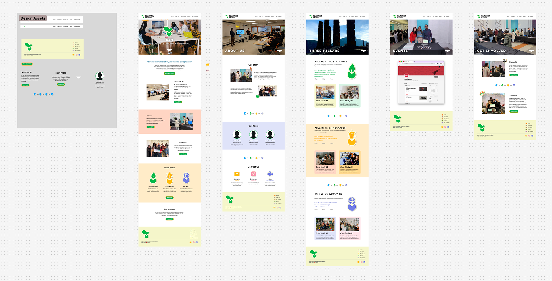
For website UI/UX and development collaboration, developers handled lo-fi wireframes under my guidance. Designers built mid-fi and hi-fi wireframes based on the approved sitemap. A full design system was created in Figma, ensuring scalable components. I built the interactive prototype and tested it with clients, the Scale Studios' Design Director, and attendees at the final showcase, gathering functional feedback for usability improvements.
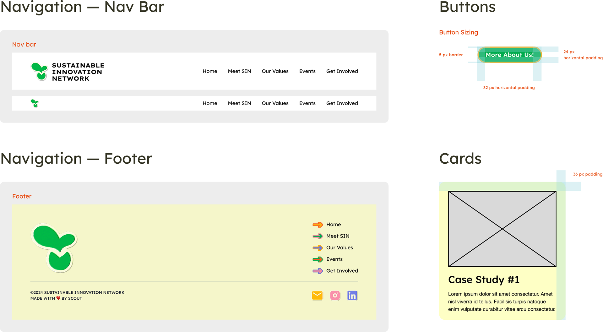
The final design handoff was done using Figma Dev Mode, allowing developers to access spacing, assets, and styling efficiently. I worked one-on-one with the Dev Lead to refine the site before launch, ensuring accessibility and mobile responsiveness, especially for users scanning QR codes.